
Bakerstreet Digital
In the landscape of digital products, a solidly built design system is the backbone that ensures consistency, efficiency, and scalability.
At Bakerstreet Digital, I had the opportunity to aid at renovating and enhancing the existing design system for a bank app. The goal was to standardize the product while empowering designers with reusable components, ultimately improving workflow and user experience (UX).
The journey began with a analysis of the current state of the design system. The design system lacked a unified structure, consistency, and up-to-date documentation. This fragmentation led to inconsistencies in the app's UI, hindering a shared foundation for the design process and language.
To address these challenges, clear purposes and principles for the improved design system were defined:

The approach to the challenge was strategic, focusing on discovering new use cases and consistently reevaluating and expanding the library. This involved prioritizing reusable components and employing a templated layout approach whenever feasible.
Additionally, research was conducted to analyze the app's competitors, their target audiences, and industry trends. Existing design elements were reviewed to pinpoint any pain points or inconsistencies that required improvement.
Another key consideration in the process was designing with real data. While low-fidelity wireframing typically involves using lorem ipsum, a deliberate effort was made to incorporate real data values when finalizing components and screens.
This approach helped minimize potential roadblocks by addressing real-world scenarios early in the design process, such as card titles exceeding one line, missing provider logos, or dealing with more than three tags on a card. Using actual data instead of placeholders allowed the team to proactively handle these challenges within the designs.
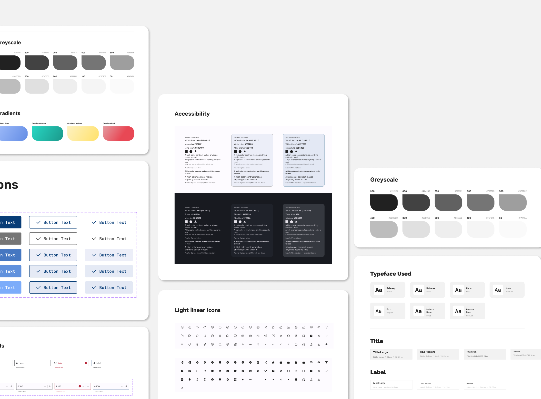
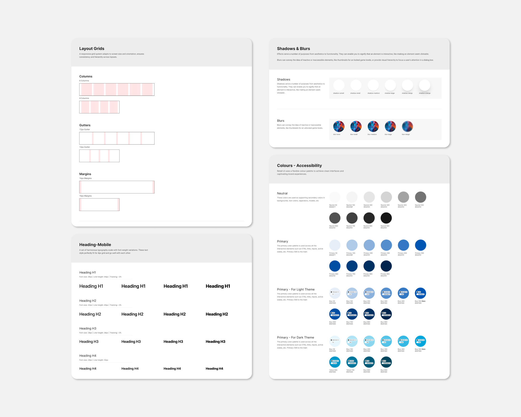
The approach to styles involved focusing on typography and the color palette, aiming for a modern and vibrant brand.
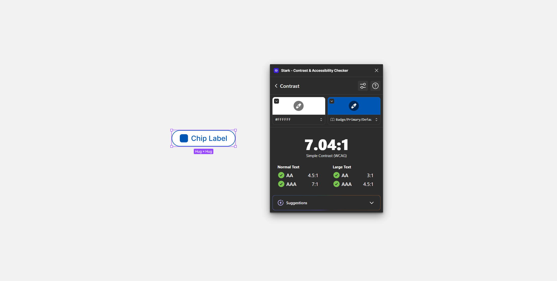
Color system was created by selecting primary and secondary colors representing the brand for light and dark themes. Color themes were designed to be harmonious, ensuring accessible text, and distinguishing UI elements, surfaces and backgrounds from one another.
Type system was created using Typefaces, Font weights, Line heights, Letter spacing were defined for Title, Label, Body, Number, Links and Button texts, optimizing for readability and legibility.
Page templates were created following dashboard UX best practices for navigation and typography hierarchy.
Key breakpoints were defined to establish a grid for layout consistency.
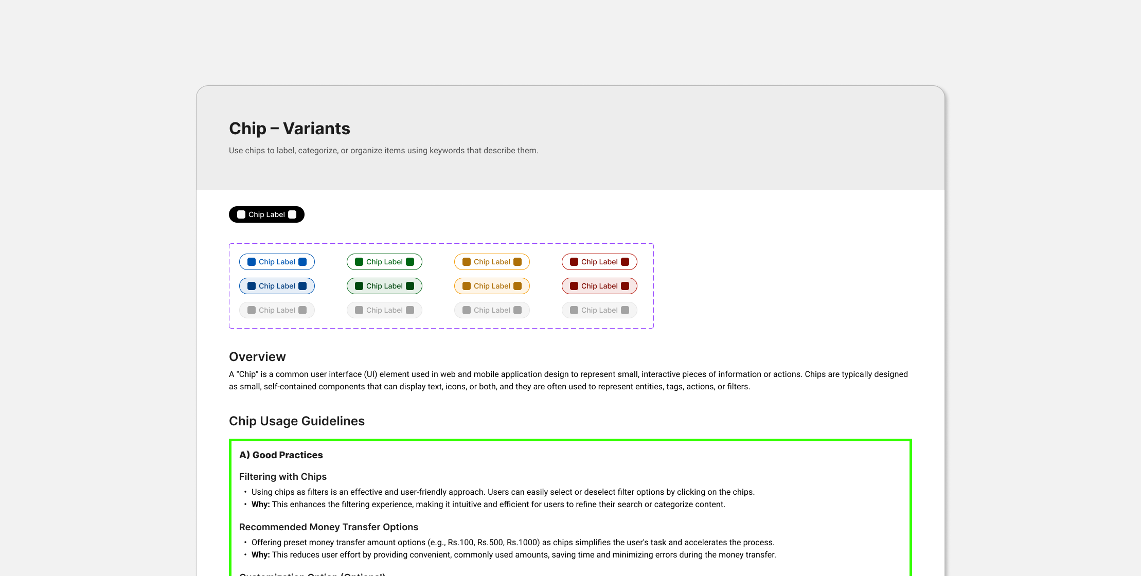
The next step was developing an evolving set of components, following the Atomic Design approach.
Using atomic design approach helped creating systems that promote consistency and scalability while simultaneously showing things in their final context.
The team collaborated to create a components list based on common components used in the flows and any new components needed in the future. This list included:
Accessibility was integrated into the process, prioritizing principles such as:
Creating high-quality component documentation was a priority to ensure an effective library that facilitates consistent decision-making. Detailed documentation was developed to cover every aspect of the design system, emphasizing organization, consistency, and ease of use.
Recognizing that a set of components alone is insufficient for a successful Design System, efforts were made to provide context for various internal users:
Once the components were approved a shared library of assets was created to enable team to easily drag and drop elements while working on their designs.
Inspiration and best practices were drawn from established design systems like Material Design by Google and others to enhance our design system.
With the release of variables in figma, next steps included intergration of variables into design system for improved handoff to the developers.